
Blai App
"Working with V3 Studio was seamless. They were creative, quick, and incredibly responsive throughout the process. I barely had to give direction — they took the initiative, brought great ideas to the table, and delivered a site that exceeded expectations. The quality, speed, and price were all outstanding. Highly recommend."

Sammy Fallah
CTO
Situation
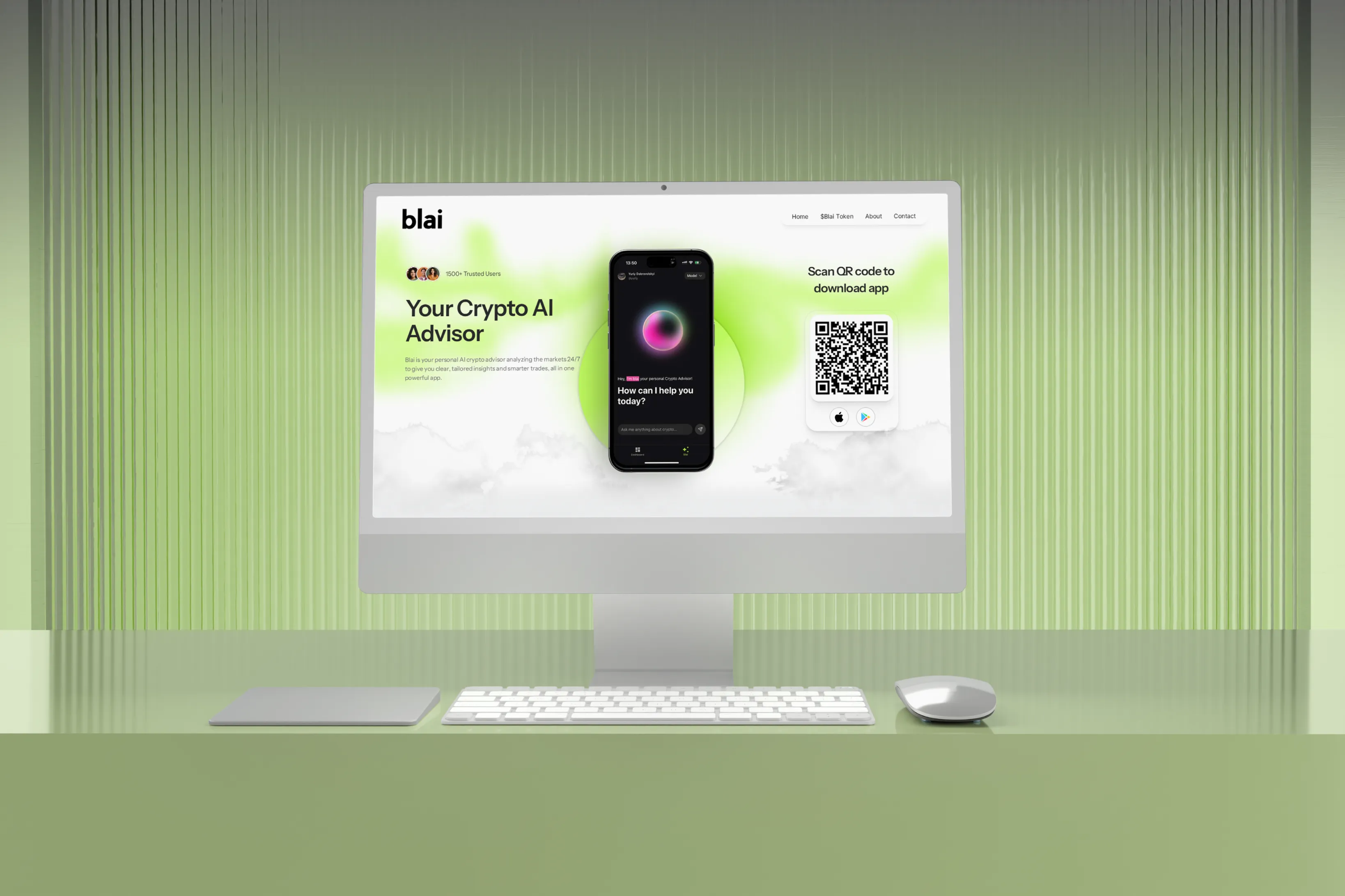
Blai is an AI advisor for crypto. It reads the market, breaks down what's happening, and tells users what it means for their portfolio without the usual noise. The product itself is bright, fast and easy to use, and they wanted a website that felt the same way the second you land on it.
Problem
Crypto sites all look the same. Dark backgrounds, glowing charts, vague promises about the future of finance. Blai didn't want any of that. They also had a lot of app to show, and the default move is dumping every screenshot into a bento grid and calling it a feature section. That works, but nobody remembers it.
Consideration
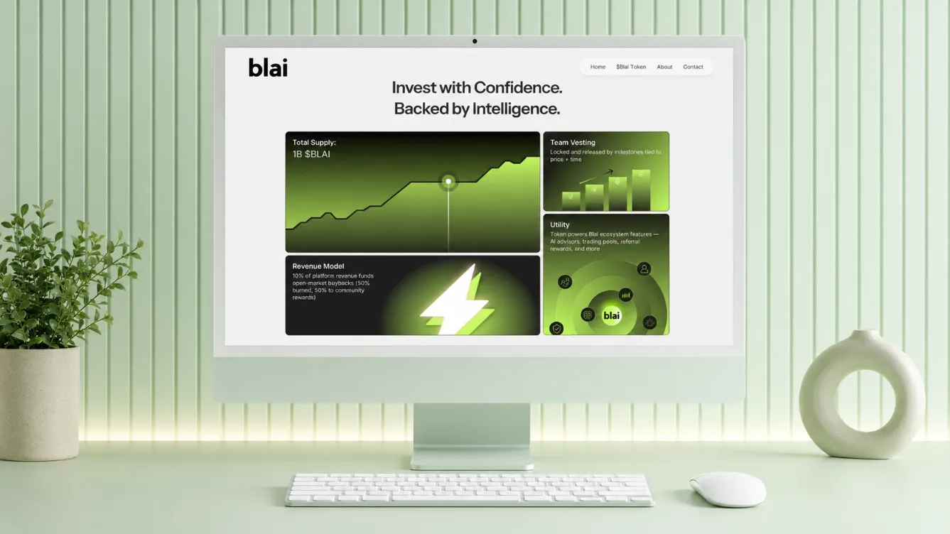
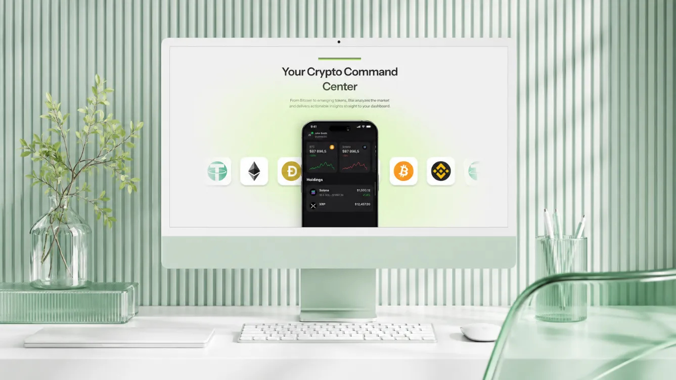
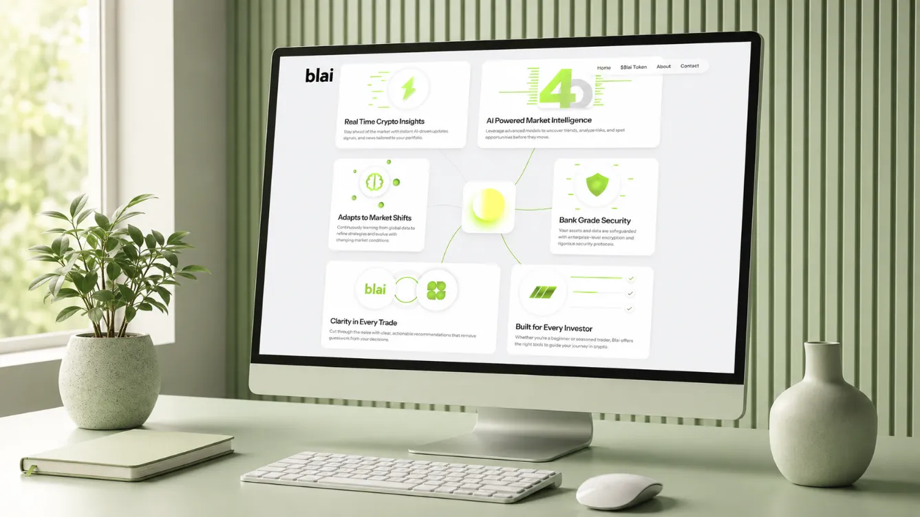
We went the other way on colour first. Bright whites, clean space, a lot of green pulled straight from their brand, so the site reads as friendly and legible instead of another terminal screen. Then we built the app showcase around scroll. As you move down the page, the screens move with you, revealing features in the order someone would actually meet them when using the product. Each interaction earns its place and shows one thing clearly. The result is a page you scroll through rather than scan, where the app is doing the explaining.
Result
Blai launched with a site that looks nothing like the rest of the category and makes the product obvious in seconds. The team loved it, and the app showcase became the section people spend the most time in.
Looking to get a project done?
Hop on a 15-minute intro call and let's chat.
Check out a few more case studies


15 min call with the founder of V3


